
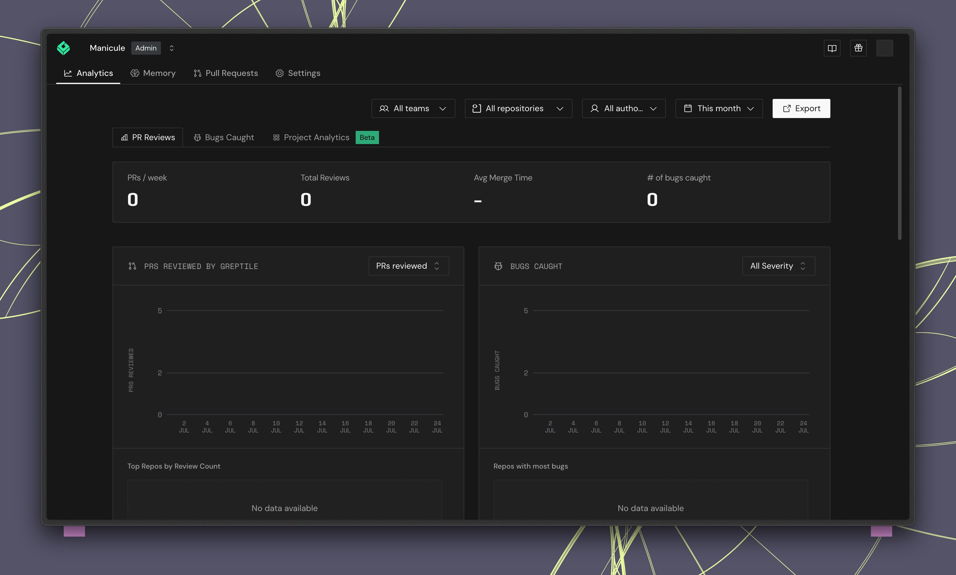
Filters
Use the filter bar at the top to scope analytics data.
Click Export to download the current analytics data.
At the team level, the Teams filter is hidden since data is already scoped to that team.
Summary cards
Four headline metrics appear at the top:Charts
Each chart includes a time series and a leaderboard sidebar showing the top repositories for that metric.PRs reviewed
A time series of pull requests reviewed per day. The leaderboard shows Top repos by review count.Critical bugs caught
Tracks critical issues flagged over time. Filter by severity level:
The leaderboard shows Repos with most critical bugs.
Addressed rate
Shows the percentage of Greptile comments addressed by PR authors over time, with an average trend line. The leaderboard shows Top repos by addressed rate.Average time to merge
Tracks how long PRs take to merge. Toggle between Mean and other aggregation methods. The leaderboard shows Top repos by merge time.Greptile comments
Displays upvote and downvote percentages for Greptile’s review comments, with a ratio chart over time. Switch between Upvote/Downvote Ratio and other comment metrics. The leaderboard shows Most upvoted comments.Using analytics to improve reviews
- Low addressed rate? Your rules may be too noisy. Adjust strictness or refine custom standards.
- High critical bug count in a repo? Consider lowering the strictness threshold for that repo to catch more issues early.
- High downvote ratio? Review your custom context rules and train the learning system with consistent reactions.
- Long merge times? Identify bottleneck repos from the leaderboard and investigate process or review load issues.